People often ask me if I get any say about the cover art for my books. Sure I do! But does anything I say end up on the cover? Rarely, which may be for the best. Here’s the story of the cover to Wake Unto Me.
My editor asked me, “Can you tell me any sort of “icons” that will be in the book? If you can just let me know of a few themes/images that you think of when writing the book, we can work with those to come up with a design.”
In response, I said and sent this:
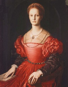
This is the portrait that was my inspiration for the de’ Medici woman burned as a witch, whose portrait hangs in the office of the headmistress:
The castle in which the school is housed will play a major role in the story:

Chateau de Beynac, photo by Luc Viatour*
Perhaps something with tarot cards? The Wheel of Fortune card is important:
I also said:
“The heroine has long, straight black hair and pale skin.
“Themes I think of are sisterhood, ancient feminine powers, alienation, longing. Longing to escape one’s origins, longing for love, longing for a sense of one’s own identity.
“A lot of the heroine’s experiences take place at night, so darkness, mist, and moonlight are good.”
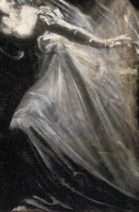
And I also sent this because I thought it was spooky:
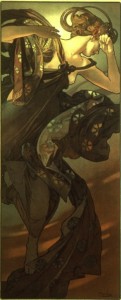
And this because I love Art Nouveau:
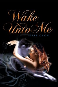
Many months later, my editor sent me the concept art that they’d come up with:
Of course, it looks nothing like any images I sent them, except maybe the smoky/ghosty bit is reminiscent of the Fuseli painting. It does capture ‘longing, mist, darkness,’ though.
The heroine’s hair is the wrong color, but oh well; you wouldn’t have been able to see black hair on a black background. Despite that, I loved the concept. My editor promised me that it would be ‘finessed’ – which I took to mean they’d fix it so the heroine didn’t look like she was wearing a big nasty wig.
The next version of the cover I saw was supposed to be the final version, the version that would appear in stores. I had two issues with it, the first of which had to do with her hands. Can you see the problem?
Her hands are on the wrong arms!!!!
My other problem was that the heroine is obviously naked. Given that this is a YA novel, it seemed a wee bit too sexy.
They reattached the hands to the correct arms, and put a tiny little black tank top on the heroine, and here’s the final version:
And that’s the story – from the author’s point of view, at least! – of how the cover to Wake Unto Me was created.
*Luc Viatour’s website.
